The Hidden Accessibility Challenge: Why Your E-commerce Text Needs to Reflow on Desktop Zoom
Hey there, fellow store owners, merchants, and e-commerce operators! In the fast-paced world of online commerce, it's easy to get caught up in sales funnels, marketing campaigns, and inventory management. But sometimes, the most fundamental aspects of your online storefront — like how your website actually behaves for every single visitor — can be overlooked. Recently, a conversation in a community forum perfectly highlighted a critical, yet often missed, challenge: ensuring your store isn't just 'mobile-friendly,' but truly responsive and accessible for everyone.
The original poster, a dedicated merchant, was meticulously building a new website and reviewing WCAG AA (Web Content Accessibility Guidelines) that needed to be followed. They encountered a snag that many might overlook: while their site looked great on mobile, the text wasn't 'reflowing' when zoomed in on a desktop browser. This isn't just a minor glitch; it's a significant accessibility barrier, meaning users who need to magnify content might find their experience broken, with text running off-screen and crucial information becoming inaccessible.
The Accessibility Imperative: Why Desktop Zoom Responsiveness Matters
In today's digital landscape, accessibility isn't just a compliance checkbox; it's a commitment to inclusivity and a smart business decision. WCAG AA guidelines are the global standard for web accessibility, aiming to make web content usable by people with a wide range of disabilities. One crucial aspect often misunderstood is 'Reflow' (WCAG Success Criterion 1.4.10).
Reflow dictates that content should be able to present itself without loss of information or functionality, and without requiring scrolling in two dimensions (up and down, and side to side) when zoomed up to 400%. For many, 'responsive design' simply means a site adapts to different screen sizes (mobile, tablet, desktop). However, true accessibility extends this to browser zoom levels on desktop. If your text runs off the screen when a user zooms in, they'll be forced to scroll horizontally, making your content incredibly difficult to read and navigate. This directly impacts users with low vision, cognitive disabilities, or even those simply using larger monitors or specific browser settings.
For an e-commerce store, this means lost sales, frustrated customers, and a potential hit to your brand reputation. If a customer can't easily read product descriptions, navigate checkout, or understand shipping policies because of poor text reflow, they'll simply go elsewhere.

Platform Nuances: The Wix Classic Editor Example
The original poster's experience perfectly illustrates how platform choice and editor versions can significantly impact responsiveness. They articulated the issue: they assumed responsive text reflow would be standard, especially when adhering to accessibility guidelines. While their text reflowed correctly for mobile devices, it failed when desktop users zoomed in. They also noted that videos offering solutions were for Wix Studio, not their 'Wix classic editor' view.
This immediately prompted a key clarification from community members: what specific Wix editor were they using? This detail makes all the difference. Wix, like many other platforms, has evolved. Capabilities for responsiveness vary significantly between older editors (like the Wix Classic Editor) and newer, more advanced ones (like Wix Studio or even Wix Harmony).
Once it was confirmed that the original poster was using the Wix Classic Editor, the path to a solution became clearer, but it also highlighted a broader lesson for all e-commerce platforms: understanding your platform's capabilities and limitations is crucial for achieving true accessibility.
Actionable Solutions: Leveraging 'Strips' and Best Practices for Reflow
For merchants using older editors, like the Wix Classic Editor, achieving desktop zoom responsiveness often requires specific design approaches. A helpful community member quickly pointed towards leveraging 'Strips' – a foundational layout element in Wix Classic – to manage content reflow effectively. Strips act as containers that can be set to stretch across the full width of the screen, and by placing text and other elements within them, you can better control how they adapt to different screen sizes and zoom levels.
General Best Practices for All Platforms:
- Use Relative Units: Wherever possible, use relative units like
em,rem,vw(viewport width), orvh(viewport height) for font sizes, widths, and spacing instead of fixed pixel values. This allows elements to scale proportionally with the viewport or parent element, making them inherently more responsive to zoom. - Flexible Layouts: Employ modern CSS layout techniques like Flexbox or Grid. These allow your content to automatically adjust and reflow based on available space, which is essential for both mobile responsiveness and desktop zoom.
- Semantic HTML: Structure your content with proper HTML tags (
,, - Test Rigorously: Don't just check your site on different devices. Test it by zooming in on your desktop browser (typically Ctrl/Cmd + '+' or using browser zoom settings). Ensure no content is cut off and horizontal scrolling is not required.
- Platform-Specific Features: Whether you're on Shopify, WooCommerce, Magento, BigCommerce, or PrestaShop, explore your theme's or page builder's responsive settings. Modern themes often have built-in features to manage text scaling and element reflow. Consult your platform's documentation or community for specific guidance.

Beyond Design: The Operational Backbone of Your Store
While ensuring your website's front-end design is accessible and responsive is paramount, it's only one piece of the puzzle. A truly successful e-commerce operation relies on a robust and efficient backend. This is where EShopSet comes in. We understand that store owners are juggling countless tasks, from managing inventory to optimizing SEO, and every minute spent troubleshooting a design issue is time away from growing your business.
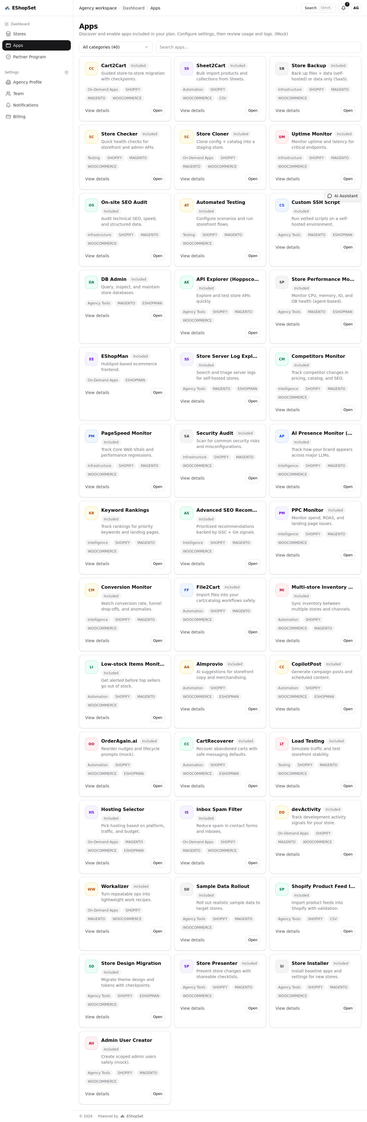
Imagine you're running a busy store, and you rely on timely notifications – whether it's a PrestaShop low stock alert or an update from your payment gateway. Just as you wouldn't want to miss these critical operational insights, you also wouldn't want your website's fundamental design to create barriers for your customers. EShopSet provides a unified control center, allowing you to discover and enable essential apps for monitoring everything from uptime and page speed to SEO performance, catalog synchronization, and cart recovery. This holistic view ensures that while you're optimizing your site for accessibility, you're also making sure your BigCommerce ai brand monitor is tracking sentiment, your security protocols are robust, and your testing environments are sound.
Our bundled apps streamline complex tasks, freeing you to focus on crucial front-end considerations like responsive design and accessibility. For instance, ensuring your critical communications aren't lost in the noise, much like an effective ESHOPMAN inbox spam filter helps you focus on what truly matters. By automating and simplifying operational workflows, EShopSet empowers you to dedicate more time and resources to perfecting the customer experience, from the moment they land on your accessible homepage to the final checkout.
Explore how EShopSet can transform your store's operations and help you build a more resilient, accessible, and profitable online business. Visit our apps marketplace to see how our solutions can support your journey.
Conclusion: Building an Inclusive and Efficient E-commerce Future
The journey to a truly accessible e-commerce store is ongoing, but it's a journey worth taking. By understanding and implementing principles like desktop zoom responsiveness and text reflow, you not only comply with essential guidelines like WCAG AA but also open your store to a wider audience, enhancing user experience and ultimately boosting your bottom line. And with EShopSet managing the operational complexities behind the scenes, you gain the peace of mind and efficiency needed to focus on these vital front-end improvements.
Don't let hidden accessibility challenges deter your success. Embrace inclusive design, optimize your operations with EShopSet, and build a thriving online store for everyone.